Project Impact
Upon the successful completion of the phased site optimization in December 2021, SimpleLegal enjoyed a significant improvement in overall site performance and organic traction compared to the previous year.
SimpleLegal pioneered legal operations software for in-house counsel, and in 2019 we completed a site redesign around that message. At the time it was the right strategy, but as their competition closed the gap, being first wasn’t enough. The message and design had to change.
The team wasn’t ready for a full website redesign project, but needed strategic changes quickly. We introduced a phased-rollout beginning with global stylistic elements, and design changes to pages essential to the primary user journey. Over time we rolled these designs across the site, ultimately resulting in a wholly transformed site by year’s end.
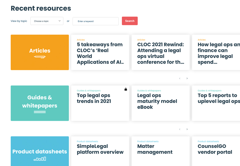
The NEW Learning Center
This section was the unintentional catalyst behind the brand's lighter, more colorful identity. It is also a popular destination, offering a unique approach to the typical website resource area.
A "Simple" Design
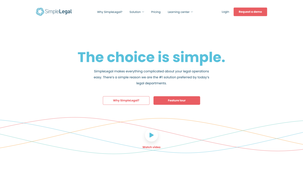
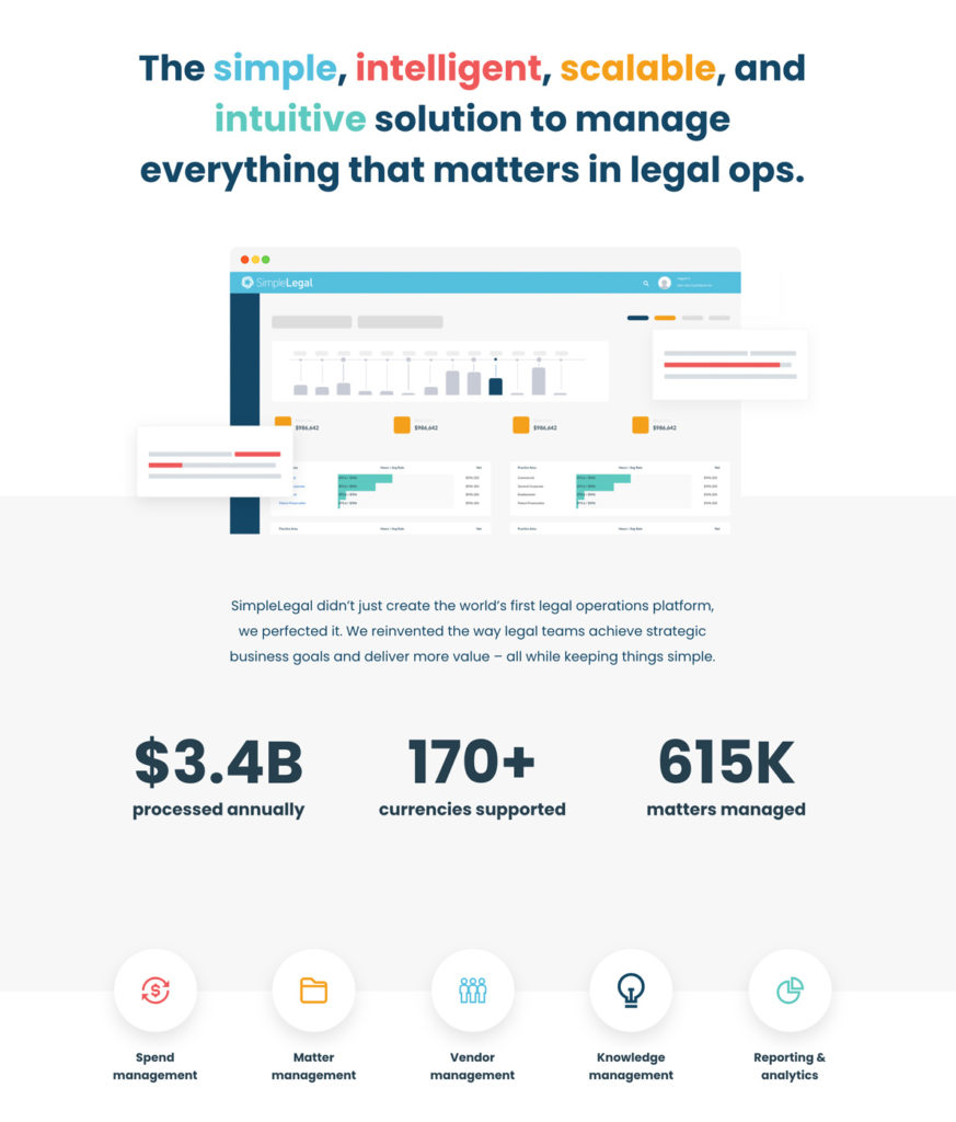
The new site design keyed in on what makes SimpleLegal the market-leading solution - simplicity. The fresh look uses vibrant colors, clean lines and open spaces to convey what users should expect of the SaaS solution.
Phased Website Redesign
We strategically chose which pages would be redesigned by first using website analytics to analyze user journeys and conversion paths.
Pricing Page & Savings Calculator
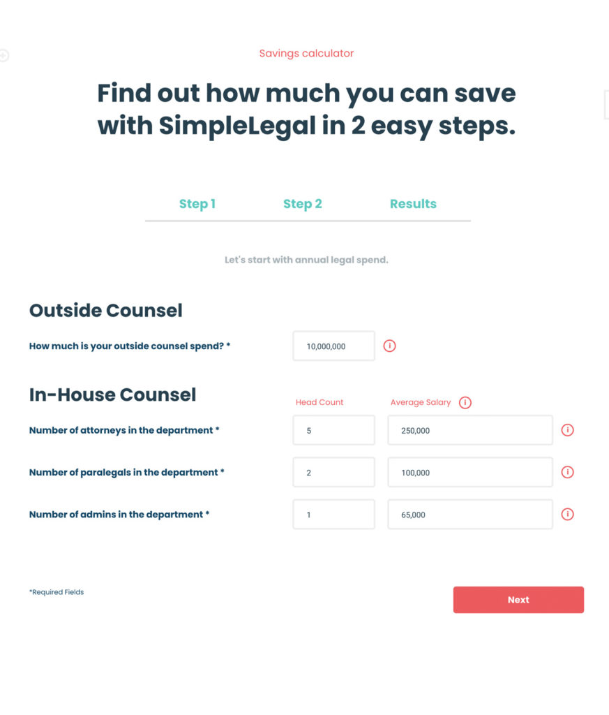
Sometimes it's better to show real savings than simply promise them. SimpleLegal's savings calculator was the perfect tool to feature on this redesigned pricing page.
Upon the successful completion of the phased site optimization in December 2021, SimpleLegal enjoyed a significant improvement in overall site performance and organic traction compared to the previous year.
Peaktwo had the expertise, but could our Silicon Valley-based company depend on a Charlotte, NC agency? Absolutely.
Laura Gunther, VP of Marketing